Alexandria.app
TIMELINE
5 Weeks
PLATFORM
Responsive Desktop Website
MY ROLE
UX/UI Designer
Visual Lead
Figma
Photoshop
Illustrator
Technology meets the modern art world.
Alexandria is a platform connecting emerging artists, buyers, and art businesses to modernize how fine art is discovered and sold online. They provide a powerful recommendation engine and data management solution for galleries and online art marketplaces. Alexandria’s mission is to empower our customers to better connect artists with consumers by harnessing the power of AI and business intelligence.
The current website is a B2B business model where Alexandria sells their software infrastructure for classifications for data management to galleries and other businesses.
THE CHALLENGE: BRINGING ALEXANDRIA TO NEW HEIGHTS
Over five weeks, my team of four UX designers researched and developed the marketplace from an artist and buyer perspective.
Our high-level goals were to:
- Onboard artist for the marketplace
- Design the buyer profile and discovery process
- Design the general layout and browsing experience for the marketplace platform
MY ROLE
I worked alongside two Researchers and the Interaction Lead as we collaborated on every aspect of the product.
In addition, as Visual Design Lead, I managed all areas of the visual design process, including the development of design systems, UI elements, and original design concepts for the new website. I also provided design recommendations, direction, and leadership to my team when needed.
KICKOFF
My team met and discussed the art world and the online marketplace industry. We identified competitors, browsed their sites, discussed our observations, and conducted our feature analysis. During this initial competitive/comparative analysis, we identified which features could be potentially helpful for our product. We also defined our individual roles moving forward and scheduled our client kickoff meeting.

Empathize & Define
After meeting with stakeholders to gain additional details and define expectations, we scheduled user interviews and created surveys. Thanks to Cary’s relationship with the art world as a professional artist herself, we were able to enlist five interview participants in the NYC area; collectors, curators, and artists aged 24 to 61. We obtained real-world data to inform our design decisions through these initial interviews. We also collected survey results from an additional 35 users to enhance our data.

Our interviews gave us invaluable insight that we would be able to use in our process and design. Before we began synthesizing our interview findings, we already noticed apparent trends, shared experiences, behaviors, and pain points among our participants that would help us prioritize what to include in our MVP. We organized those key findings into categories for our affinity map.

Some key insights from our user interviews and surveys include:
- Artists don’t enjoy the business side of selling their work
- Artists are more interested in online art platforms if they don’t have to pay fees
- Collectors and curators are interested in the artist’s personal story, passions, and motivations
- While the internet is the future, collectors and curators still enjoy seeing art in person
- Instagram is the most commonly used platform for artist
- Genre, medium, and price are the most common factors in finding and purchasing work
Personas
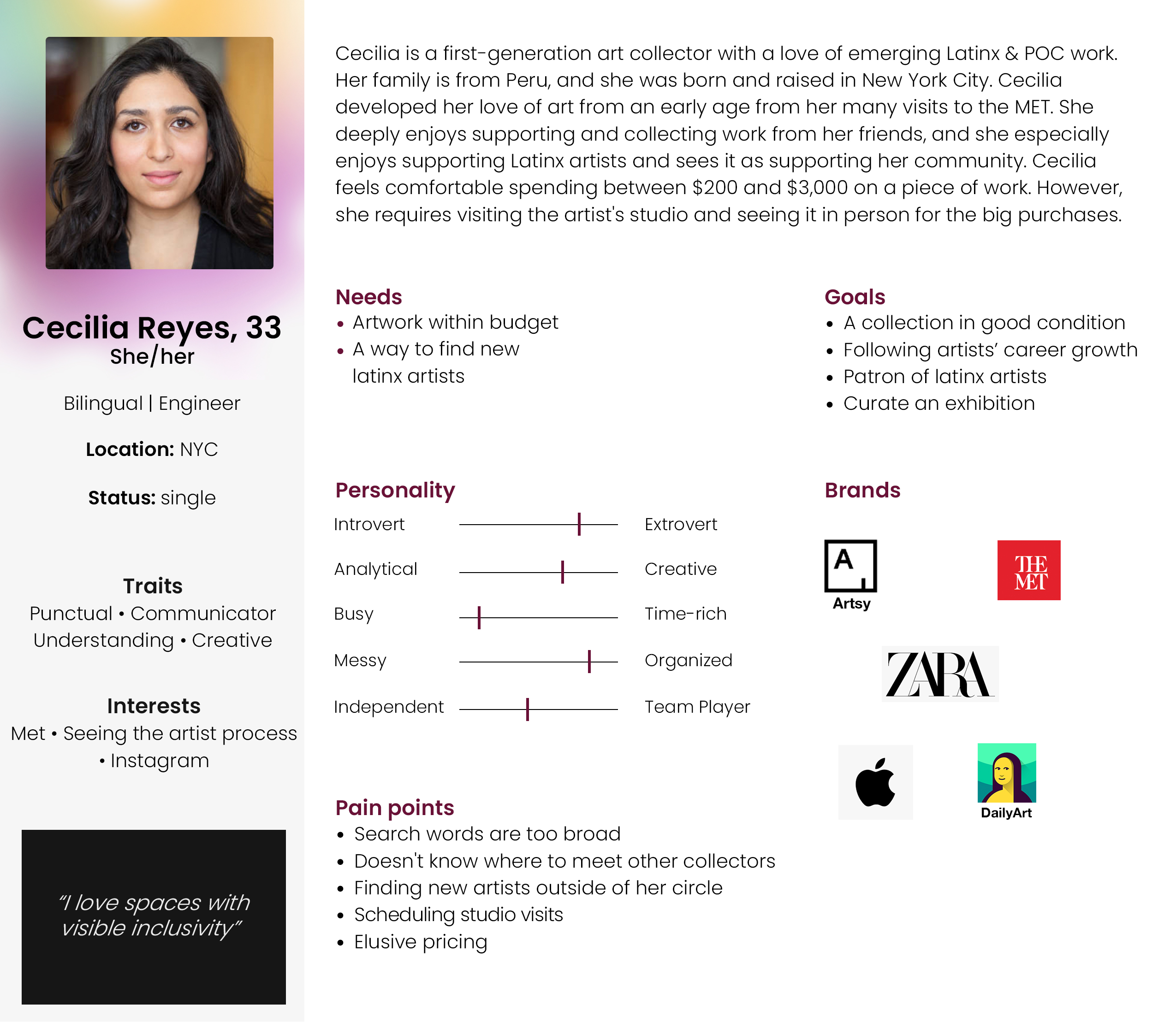
We had collected enough data to create two detailed personas, one art collector and one artist.
MEET CECILIA
MEET HOPE
We created a prioritization matrix to understand what is essential and possible within our time frame. We found this to be a helpful design tool and a critical visual for communicating these constraints to stakeholders.
We then created user flows for key interactions to include in our prototype. I was responsible for creating the flow for uploading a piece of artwork from the artist’s perspective.
Ideate
Once we understood our users and identified key features, we collaborated in a design studio to brainstorm design ideas. We each created initial sketches to create multiple solutions for key pages of the site. When we came back together, we pitched our ideas and decided which ones to move forward with into the low-fidelity phase.

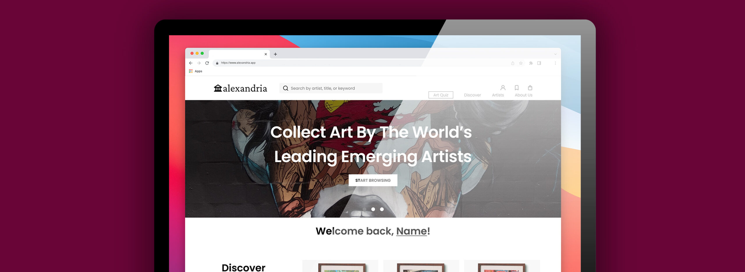
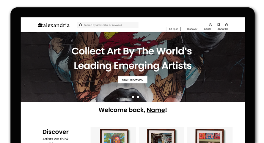
Since the Alexandria experience needed to cater to three different perspectives (the B2B market in need of the AI technology that Alexandria is known for, buyers, and artists), we ensured the landing page included entry points for each type of user.


We also wanted to emphasize the feature that sets Alexandria apart from the competition, the personalized recommendations quiz. Since the art quiz helps users define their tastes and informs their experience on the site, it is featured prominently on the landing page and easily accessible from the top navigation menu to be taken or retaken at any time. In addition, we added preferred genres and artist mediums, and we gamified the experience by adding thumbs up and down icons, a progress bar, and “swiping” animations that you will see demonstrated in our prototype.
On the profile pages, our layout reflects our users’ desire for community and connection in the art world, even when in a virtual setting (a central theme of our research findings). Users can follow each other’s pages, send messages, save artwork they like, and create collections.
Artists can provide as much relevant information and context as they want for those interested in their work. They can post articles, affiliations, Bio, a personal statement, current exhibitions, Instagram, year of birth, and location. Artists can also indicate that they are open to commissions or in-person studio visits to get that in-person connection.

We designed the user’s account settings to be their hub for all their preferences and needs while using Alexandria. In addition to managing their profile, users can upload artwork, view their saved favorites and collections, review analytics, and set up security preferences. We also included an entry point for “favorites” in the navigation menu for easier access and to help keep works and artists top of mind.
In addition to a smooth and enriching experience, we wanted to give the user agency. If users want to browse without logging in or creating an account, they can do that. If they decide to join, there are multiple ways to log in or create an account. We also placed a “delete account” CTA prominently in the account settings because users we interviewed made it clear that they are frustrated when platforms make that difficult.

Another key feature we prioritized is a robust search experience. We wanted the search for artists and work to be accessible from multiple entry points and enhance that personalized experience by allowing the user to search for specific criteria. Therefore, in addition to the standard e-commerce filters such as relevance and sort by lowest-to-highest price, we included:
- A filter for artist medium
- Sliding scales to define a specific price range and artwork dimensions
- Options for color and genre
We also wanted to prioritize accessibility for our users to highlight a focus on inclusion and optimize the Alexandria website for the future.
Cary took the time to do additional research on best accessibility practices. For example, we avoided the placement of vital content on carousels since, statistically, users don’t get to the end of the carousels, and that information never gets seen. In addition, carousels and pop-up screens are both incompatible with screen readers.
We carefully chose our colors and fonts to ensure a contrast ratio of 7 or above and checked our designs for common accessibility issues to ensure it was ADA compliant.
Our mission to create an inclusive experience and our desire to create a clean, modern layout that lets the artist’s work shine ultimately informed our aesthetic choices.
We wanted the new phase of Alexandria to reflect the art community itself, modern and aesthetically pleasing. The Alexandria logo was to remain the same, but we perceived the maroon color on the original site felt overly academic or formal. So we chose a new maroon color with a purple hue that we felt was more current and inviting. In addition, we chose a sans-serif font that was simultaneously modern and legible.

Prototype
Check out a demo of our final prototype.
See how it all came together.
Overall, users could easily navigate the tasks, expressed interest in Alexandria, and provided positive feedback.
“Very inviting. I want to keep scrolling!”
“I definitely want to keep exploring and check out artwork.”
“Can I join?!”
Annotations for the Developers
In order to set the Alexandria up for success after the handoff, it was important to create thorough notes for the developers. I created documents detailing everything they will need to know for easy reference while building out the product during the next phase.
SO, WHAT’S NEXT?
We outlined the following priorities for Alexandria’s next phase:
- Artist payment process
- Shopping cart and checkout process
- Design About Us and Artist Directory pages
- Use AI technology to render staged living space mockups to give virtual buyers a sense of the scale of a piece and how it might look in their own spaces
- Notifications Center to stay up to date on artist happenings and new artwork
- Maintaining general accessibility principles on the website to ensure inclusion for all people and build a safe community
- User Support/Help Center
We look forward to seeing the new Alexandria.app experience go live at some point in the summer of 2022.


