Zoom: Optimized
TIMELINE
4 Weeks
Desktop App
UX/UI Designer
Interaction Lead
Figma
Photoshop
Illustrator
Setting the scene.
Imagine for a moment you’re a teacher in the winter of 2020. You might love it, maybe not, but either way, you’re in a career that comes with a slew of challenges on top of being responsible for shaping the minds of future generations. No pressure. Now imagine COVID arrives abruptly and forces schools to make the emergency switch to remote instruction, and you, at no fault of your own, are not prepared. Instead of teaching from your classroom with the resources you’ve relied on, you’re on Zoom, pitted against technical limitations and limitless distractions. Zoom saved the day in many ways, but let’s face it, it was originally optimized for the business world.
That was the reality facing teachers as they braved the most challenging period for educators and students in our nation’s history. By the end of the first year, the negative impact was measurable. One McKinsey analysis shows K–12 students were, on average, five months behind in mathematics and four months behind in reading.
Since the winter-of-which-we-do-not-like-to-speak, Zoom has seen a 2900% increase in their daily meeting participants, in no small part due to Education. Zoom is undeniably a top performer in the video conferencing market. Still, as competitors ramped up their offerings, they saw a 15% decrease in time spent on the desktop app by educational customers during the pandemic’s peak.
So that’s where we came in. For this project, my team was tasked with optimizing Zoom’s desktop app features for its educational customers. The end goal was a more efficient remote classroom setting, a return of loyal customers, and increased revenue for Zoom.
The Problem: Educators need intuitive, accessible features and a reliable way to maintain lines of communication with students during class.
My Role: I collaborated with 4 other UX Designers on this project, each of us with a different concentration. I was responsible for conducting competitive research, and taking ownership of a feature from the user flow, to interactive wireframes. In addition, as Interaction Lead, it was my responsibility to create an asset library, edit product screens and flows as necessary, ensure brand standards and visual consistency, and uphold best practices of graphic design principles.
“Being in your bedroom or your dining room and constantly attending classes (from) there, I think it made (learning) harder and less fulfilling.”
Research
“Every problem is an opportunity in disguise.”
Statistics
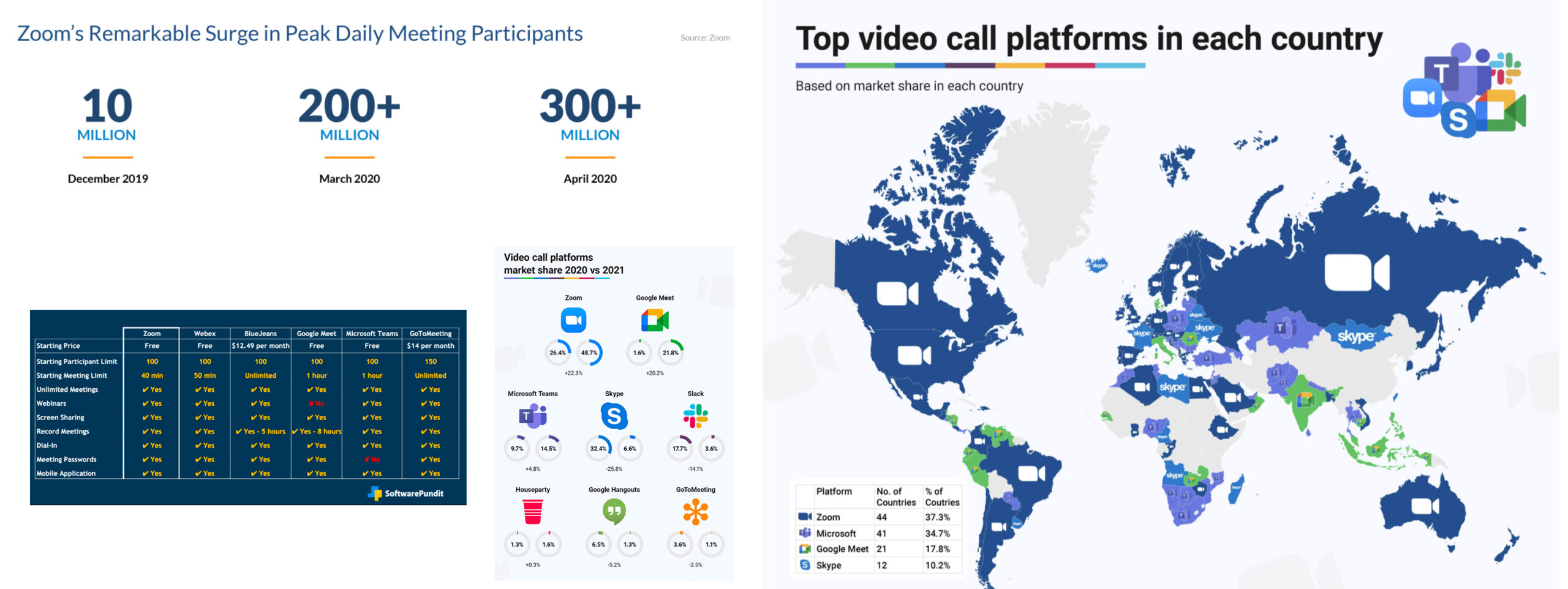
- Over 90,000 schools used Zoom at the height of the pandemic. (Zoom 2021)
- Zoom surpassed 350 million daily meeting participants in 2020. (Zoom 2020)
- Zoom’s daily active users increased 2,900% in the span of 4 months during 2020. (Bloomberg 2020)
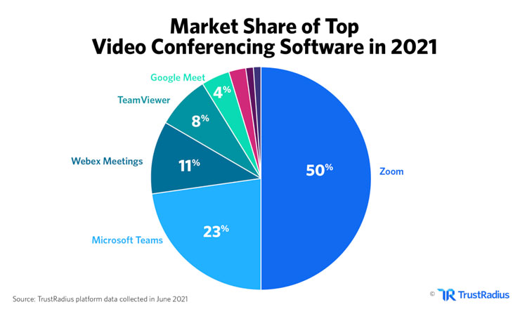
- Zoom dominates 50% of the video conferencing market in 2021. (TrustRadius 2021)
User Interviews
Kayla, Ashley, and Jen then conducted a series of 1:1 interviews with educators to understand users’ recent experiences with online teaching to identify their needs and pain points.


Finally, we synthesized our findings to see what patterns and trends would emerge and gained the following insights:
- Users want better teacher-student communication
- Users feel limited by the current Zoom features
- Uses want commonly used apps to be more accessible
The user needs
- Users need to be able to see the class while in presentation mode
- Users need more learning tools and features
- Users need everyday apps to integrate with Zoom and be accessible from the toolbar menu
Meet Miss Stephanie
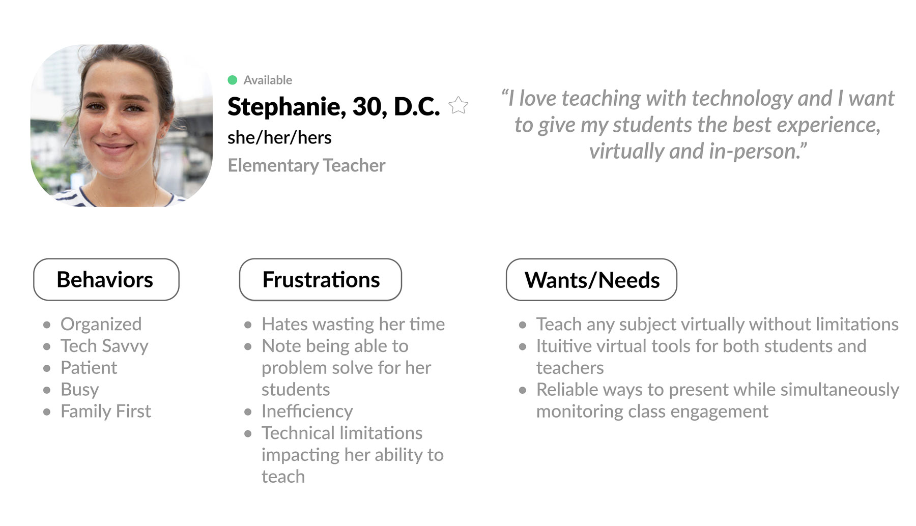
The initial research prepared us to develop a primary persona to represent our target user, Stephanie, an elementary school teacher. Throughout the project, we would return to Stephanie (or “Miss Stephanie,” as we affectionately called her) to keep our user’s goals, motivations, and pain points at the forefront of our decisions.
Ideation
Turning insights into ideas.
At this stage, we could begin to ideate solutions. We identified our priorities based on our user’s needs, how-might-we statements, and what was possible within the timeline to ensure our MVP. We considered possible constraints. We asked, “what haven’t competitors tried?” and “what can we do better?”
…add features to the whiteboard that teachers will find useful?
…reimagine the gallery view in presenter mode so Stephanie can see her class?
…open the lines of communication between student and teacher?
We landed on the following key features:
- Improved presentation mode with an expanded gallery view
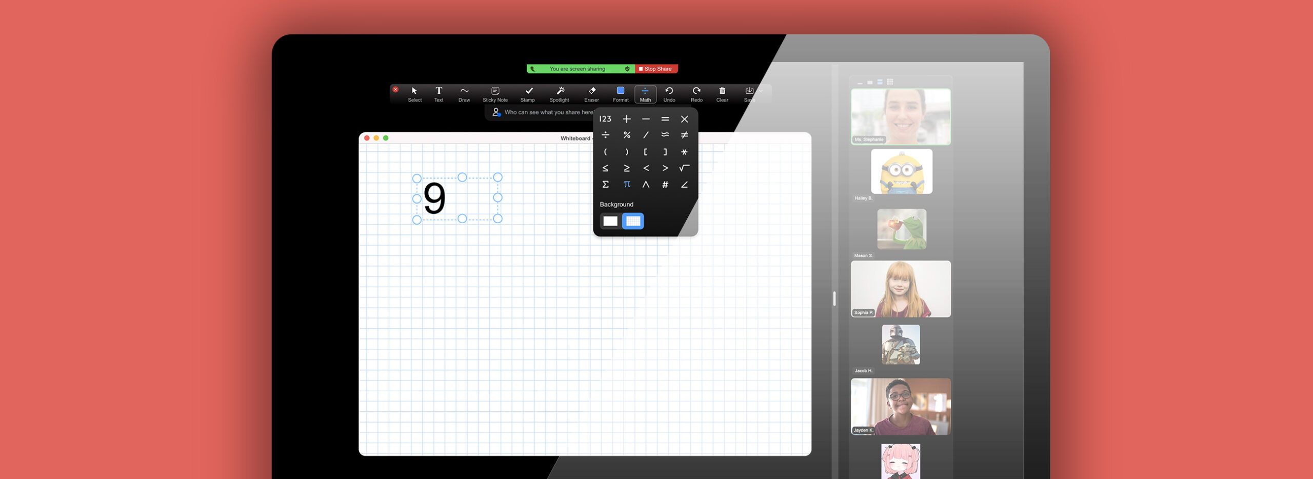
- Expanded whiteboard features including a suite of math tools, sticky notes, google drive integration, and a “pause” toggle button that gives the presenter full control of when and how students participate on the board
- Question/Answer messaging
- Polls
- Music app that integrates with popular music apps like Spotify, Youtube, and Apple Music
- Timer, both easily accessible to the admin from the toolbar

Design
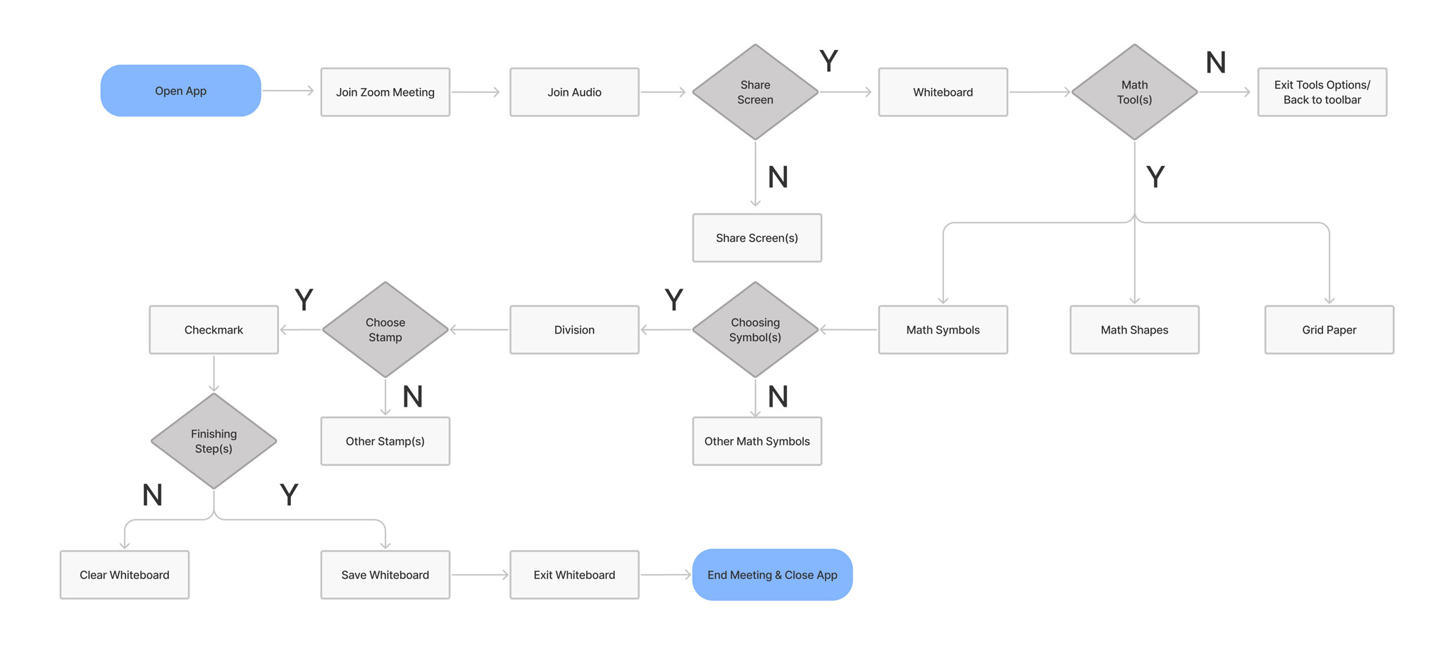
Out of our list of features, my focus was on the design and development of the math tool suite for the whiteboard. First, I created a user flow from the POV of Miss Stephanie, identifying the key screens and interactions she would need to write a math equation. By mapping out these pathways, I defined the required screens and developed a logical flow.
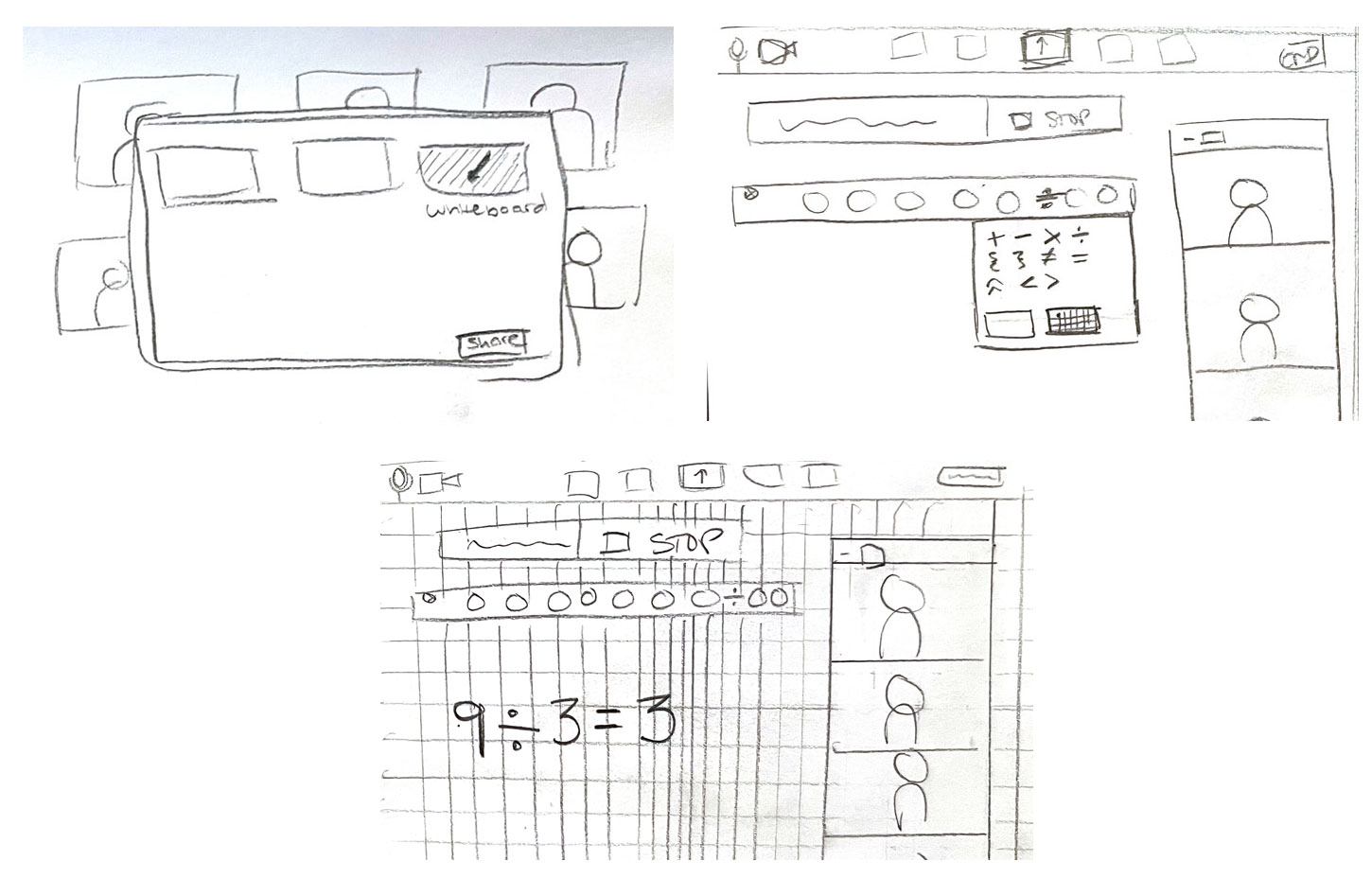
Next, I sketched out ideas for the layout of each screen. In the current version of Zoom, the only whiteboard tool available for teachers and students to practice math is the drawing tool, which can be awkward, inconvenient, and messy. Multiple users expressed that this was a problem for them and their students, so the end result would need to enable participants to smoothly create equations without losing momentum in the lesson.
Branding & Component Library
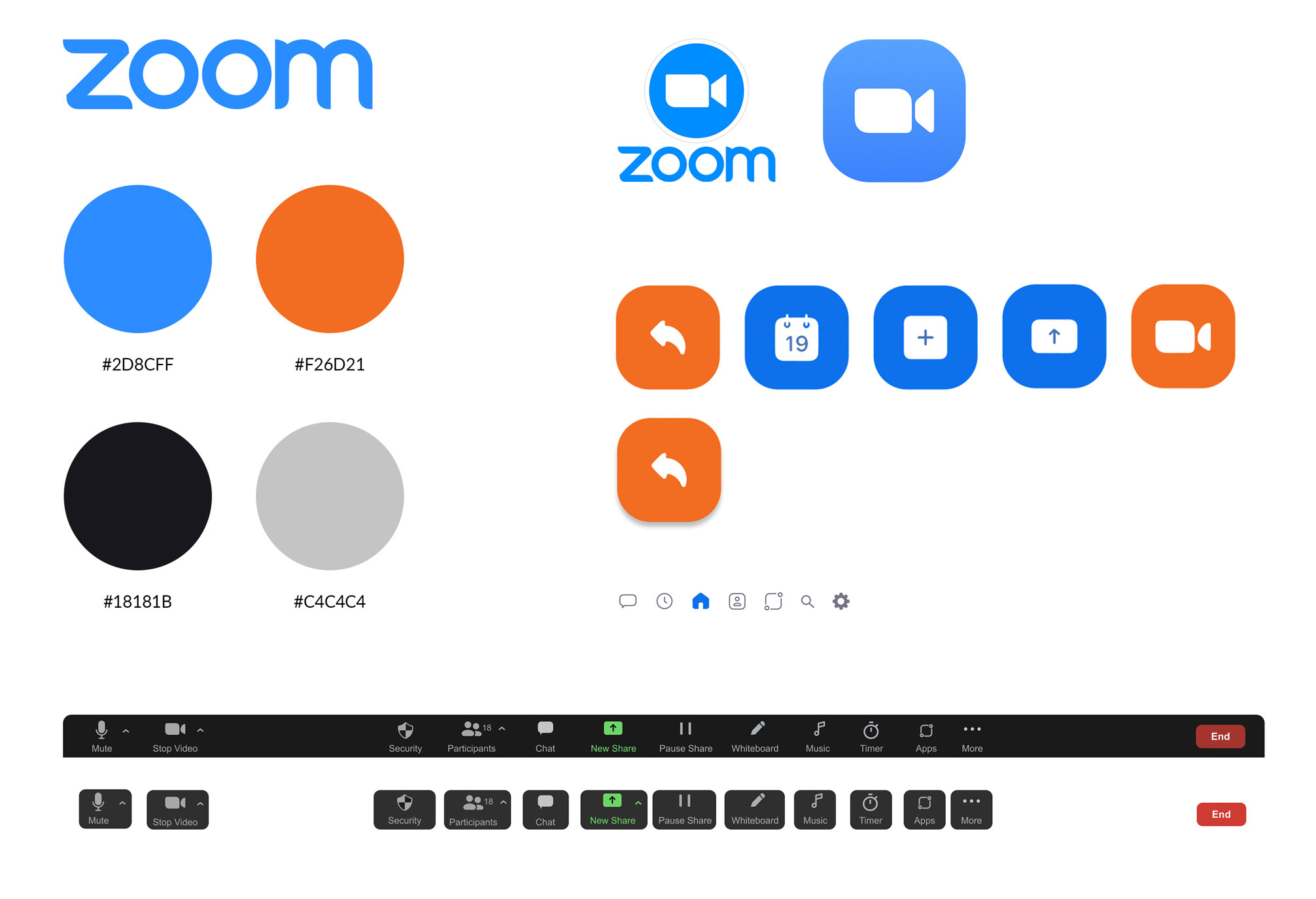
Before moving to high fidelity designs, I created a brand guide to understand Zoom’s existing branding. Next, I gathered the logos and colors for reference and built a component library in Figma for commonly used UI elements. This process allowed the entire team to apply Zoom’s visual design to the new features and then integrate those features seamlessly into the existing app, creating a consistent visual experience throughout our prototype.
Prototype
Bringing it all together.
I then applied my user flow and sketches to create high-fidelity wireframes, making sure to reference elements in the existing app. These wireframes were later integrated with the other features to build one fluid prototype for usability testing.
Please note: this video include sound
Results
Users were able to complete 100% of the tasks compared to a 43% completion rate on the original app, and users were able to complete the tasks in about half the amount of time, on average. We believe this is why 100% of participants said that our added features would make Zoom their preferred video conference platform.
%
of tasks completed compared to 43% on the original app
%
faster completion time on tasks
%
of users would prefer Zoom with the new features
So, what’s next?
With more time, we would continue to build on the features and apps we created. For example, I would explore more subject-specific learning tools for the whiteboard. I’d also like to leverage the insights from user testing to design a more comprehensive background feature for the whiteboard that lives outside of the math tool. I think it would also be worth exploring optimization for emerging hybrid models as COVID restrictions continue to loosen and Zoom strives to continue to innovate into the future.
A special thanks to my fellow Zoomies, Jen, Ashley, Kayla, and Kyle for being supportive, hard-working, and collaborative rock stars.
Thanks for stopping by!
Let's collaborate:
